
BRAND IDENTITY / CASE STUDY
Pop’s Coffee
A bold local coffee brand built around warmth, simplicity, and everyday connection.
LOGO DESIGN / VISUAL IDENTITY / BRAND DIRECTION
PROJECT OVERVIEW
A NEIGHBORHOOD COFFEE BRAND.
Pop’s Coffee was created as a simple, memorable local coffee identity built around familiarity, warmth, and everyday connection. I developed the logo and visual direction to give the brand a bold, recognizable look that could translate naturally across the café environment.
LOGO CONCEPT

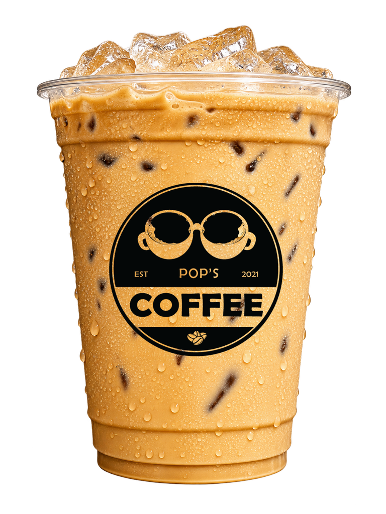
I wanted the mark to feel familiar at first glance but reveal something more on closer look. The shape starts with eyeglasses and a coffee cup, then combines them into two cups facing each other — a simple symbol for coffee, conversation, and connection.
The goal was to create a mark that felt simple enough to remember, but distinctive enough to become recognizable across the café’s visual identity.
CLIENT TESTIMONIAL
“Kevin has helped me achieve my 15-year-old dream of having a coffee shop. In a span of 2 hours, he sent me the logos to choose from, and everything was spot on. We are successful in our business today because of the logo he created for Pop’s Coffee.”
Kamil Bernardo
Owner, Pop’s Coffee
VISIT POP’S COFFEE
2F, BF Resort Village
B56-B Lot 1-B Aventine Hills
Las Piñas, Metro Manila
Follow them on social media